

Proxima Nova Font: A Modern Typeface for the Digital Age
Typography plays a vital role in shaping the visual identity of brands, digital interfaces, and printed materials. Among the many typefaces that have gained prominence over the last few decades, Proxima Nova stands out as a modern, versatile, and widely used sans-serif font. Designed by Mark Simonson, Proxima Nova has become a favorite of designers, developers, and brands alike for its clean lines, geometric structure, and contemporary aesthetic. This essay explores the origins, features, applications, and cultural impact of Proxima Nova, explaining why it has become a cornerstone of modern typography.
Origins of Proxima Nova
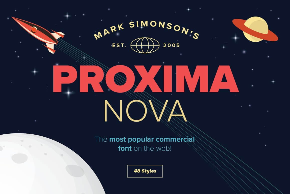
Proxima Nova was created by type designer Mark Simonson in 2005. However, its roots trace back to 1994 when Simonson designed Proxima Sans, the precursor to Proxima Nova. At the time, Proxima Sans was intended to fill a gap between geometric sans-serifs, such as Futura, and humanist sans-serifs, such as Gill Sans. While Proxima Sans had a modest reception, it laid the groundwork for what would eventually become Proxima Nova.
A decade later, Simonson revisited the design, refining its structure and expanding its scope. The result was Proxima Nova, a typeface that combined the geometric precision of fonts like Futura with the warmth and readability of humanist fonts like Helvetica. This hybrid nature is what gives Proxima Nova its unique appeal, making it adaptable to a wide range of applications.
When Proxima Nova was released, it quickly gained traction in the design community. Its clean and balanced design, coupled with its extensive range of weights and styles, made it an attractive choice for both print and digital projects. Today, Proxima Nova is one of the most popular typefaces in the world, used by major corporations, small businesses, and independent designers alike.
Design Features of Proxima Nova
The success of Proxima Nova is largely due to its thoughtful design. By blending geometric and humanist principles, Mark Simonson created a typeface that is both modern and approachable. The following features highlight what makes Proxima Nova unique:
1. Geometric Foundation
Proxima Nova is rooted in geometric sans-serif principles, characterized by clean, simple shapes and consistent proportions. This is evident in its circular “O” and symmetrical letterforms. The geometric base gives the typeface a modern and minimalist aesthetic, making it ideal for contemporary design.
2. Humanist Warmth
Despite its geometric foundation, Proxima Nova incorporates subtle humanist features that make it more readable and approachable. For example, the lowercase “a” has a double-story design, and the letters have slightly softened edges. These details add warmth and personality to the typeface, distinguishing it from colder, more rigid geometric fonts.
3. Wide Range of Weights and Styles
Proxima Nova comes in 48 variants, offering an extensive range of weights (from Thin to Black) and styles (Roman and Italic). This versatility allows designers to achieve a cohesive look across various applications, from headlines to body text. The availability of condensed and extra-condensed styles further enhances its adaptability.
4. Designed for Versatility
The proportions of Proxima Nova are carefully balanced to ensure legibility at all sizes. Its open apertures, balanced x-height, and consistent stroke widths make it equally effective for small body text and large display headlines. This versatility is one of the reasons it has become a go-to font for web and mobile interfaces.
5. Neutral Yet Distinctive
One of Proxima Nova’s most significant strengths is its neutrality. While it has a distinctive character, it does not overpower the content it conveys. This makes it an excellent choice for branding, as it can adapt to a wide range of visual identities without clashing or dominating.
Applications of Proxima Nova
Proxima Nova’s versatility has made it a favorite across a variety of industries and media. It is used by global corporations, small businesses, and individual creatives for everything from branding to user interfaces. Some of its most common applications include:
1. Web Design
Proxima Nova has become a staple in web design due to its clean and modern appearance, as well as its exceptional legibility on screens. Its balanced design ensures that it looks great at both small and large sizes, making it ideal for everything from navigation menus to headlines. Many websites, including major platforms like Buzzfeed and Mashable, have adopted Proxima Nova as their primary typeface.
2. Branding and Identity
Proxima Nova’s neutrality and adaptability make it an excellent choice for branding. It can convey professionalism, modernity, and approachability, depending on how it is used. Brands such as Spotify, Wired, and Twitter have incorporated Proxima Nova into their visual identities, leveraging its versatility to create cohesive and recognizable designs.
3. Print Media
In addition to digital applications, Proxima Nova is widely used in print media. Its clean lines and balanced proportions make it well-suited for magazines, brochures, posters, and other printed materials. The wide range of weights and styles allows designers to create visual hierarchies and maintain consistency across different types of content.
4. User Interfaces
With the rise of digital interfaces, Proxima Nova has become a popular choice for apps and software. Its legibility, even at small sizes, makes it ideal for buttons, labels, and other interface elements. Its modern aesthetic also aligns well with the sleek and minimal designs favored in the tech industry.
5. Advertising and Marketing
Advertising campaigns often rely on typefaces that can grab attention while remaining legible and versatile. Proxima Nova’s clean and modern design makes it an effective choice for both print and digital advertisements. Its wide range of styles allows marketers to create bold headlines and readable body text within the same type family.
The Cultural Impact of Proxima Nova
Since its release, Proxima Nova has become one of the most widely used typefaces in the world. Its popularity speaks to its exceptional design and versatility, but it also reflects broader trends in typography and design.
1. A Reflection of Modern Design Trends
Proxima Nova embodies many of the principles that define modern design: simplicity, functionality, and adaptability. Its clean lines and geometric structure align with the minimalist aesthetic that has dominated design in the 21st century. At the same time, its humanist warmth ensures that it remains approachable and engaging.
2. A Typeface for the Digital Age
Proxima Nova’s rise to prominence coincided with the growth of digital media. Its design is well-suited to the challenges of screen-based typography, such as legibility at small sizes and scalability across different devices. As a result, it has become a favorite of web designers and developers, cementing its status as a typeface for the digital age.
3. Widespread Adoption by Major Brands
The widespread use of Proxima Nova by major brands has further solidified its cultural significance. Companies like Spotify and Twitter have helped to popularize the typeface, making it a familiar presence in the lives of millions of people. Its association with successful and influential brands has also contributed to its reputation as a modern and reliable typeface.
4. Inspiration for Other Typefaces
The success of Proxima Nova has inspired the development of other typefaces that blend geometric and humanist principles. Its influence can be seen in the work of contemporary type designers, who continue to explore the balance between form and function.
Conclusion
Proxima Nova is more than just a typeface; it is a symbol of modern design. Its clean lines, geometric precision, and humanist warmth have made it a favorite of designers, developers, and brands around the world. From web design to branding, its versatility ensures that it can adapt to a wide range of applications, while its cultural impact reflects the evolving trends of the digital age. As typography continues to play a crucial role in communication and design, Proxima Nova stands out as a timeless and indispensable tool for creating clear, compelling, and modern visual content.
This is the demo version. Proxima Nova Font Family free for personal use. For the full version and commercial purposes, please visit here
License: Free for Personal Use!
Font Type: TTF
Stock: Unlimited
Format: .Zip
Total Files: 1
Custome Description
Share Now!
Related Products


Popular & Trending


Featured Products

